
Highlights of progress so far
Please read the below before clicking any navigational links… Also, just as a warning the menu options on the top are placeholder/introductory and are not meant to reflect the final navigation of the site. They also may land you in some odd places. This is very much a draft in progress.
The Corporate Theme and Home Page
I’ve been playing with the proposed theme, trying to tame it and wrangle the placeholder content into something more in line with the content of the CO OMTA site. This page is in effect a demonstration of the draft of the re-purposing of the theme to use the proposed color palette. You’ll notice a background image on the page overlaid with the Sand color, the use of the dark grey text, and other colors as section headers throughout this page.
When you click the logo in the upper left corner (not just yet, though, finish reading here, please 🙂 ), you’ll be taken to the parallax homepage where I’ve been able to incorporate some music-related stock images, text from the existing homepage, and introduce the basic colors proposed above. There is still some of the original/placeholder content on that page — some has yet to be replaced and some I’m still trying to figure out how/where to change.
Also, notice the font is not plain Arial. 🙂
A Central Oregon-Inspired Color Palette
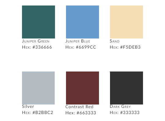
An update from the existing site’s theme, the colors proposed here are inspired by the juniper trees so common around Bend and Redmond. Currently, the theme uses the green for most action buttons, the primary text headers on the page, etc. The juniper berry blue will be for secondary headers and possibly buttons. The deep red provides contrast to both and will be used for 3rd and lower headers, text links and the like.
The other colors are for contrast for the background (Sand), text highlights on buttons (Silver), and the dark grey for general text/legibility.
An update to the logo using the color palette
To make the logo stand out, I’ve added some of these colors to the updated logo with the OMTA and lyre in the green with the Central Oregon Chapter subhead in the red. To help with visibility and legibility, the whole is placed on a field of white

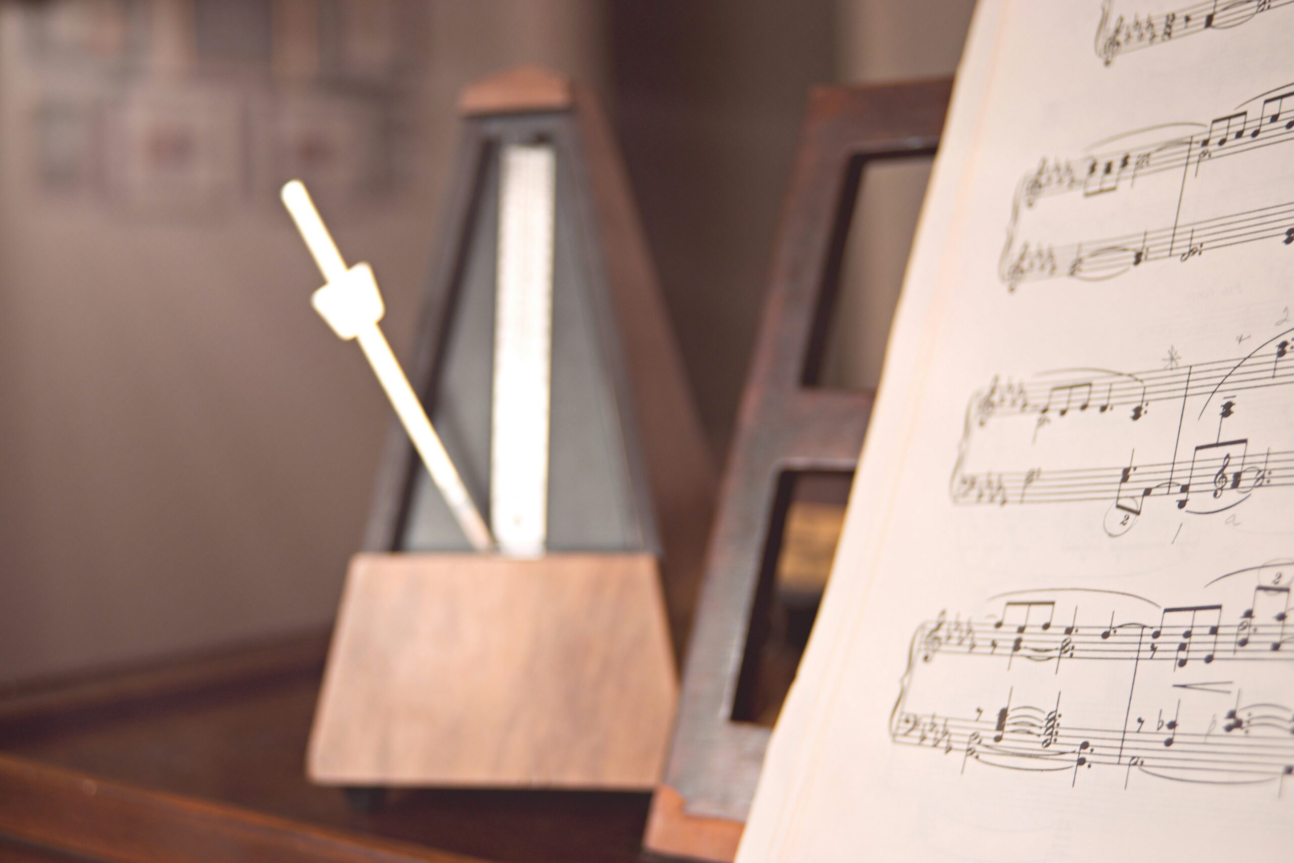
Photos
I found and downloaded a number of stock images (there’s one at the top of this page). Of course, we can expand the repertoire of images as we go; I just wanted a few to get started. I set up a gallery page of the photos I’ve downloaded; these are all free images from one of the stock sites.